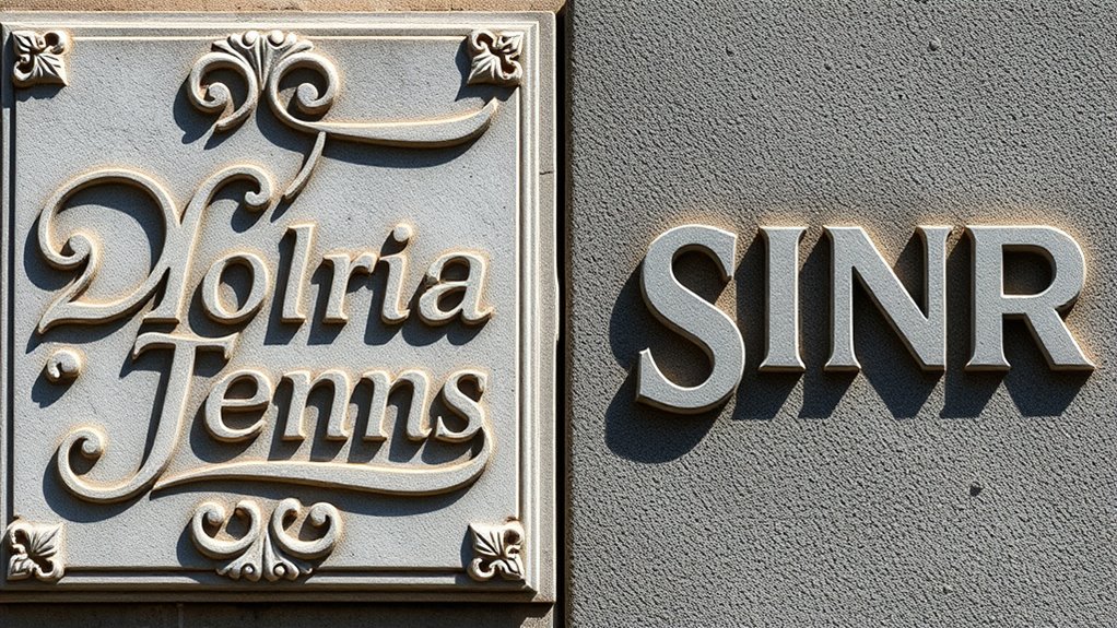

When carving lettering, you’ll notice that serif styles feature small strokes at character ends, giving a classic, elegant feel rooted in historical inscriptions, while sans-serif styles are clean and minimalist, emphasizing modern simplicity. Serif carvings are more detailed and delicate, involving careful chip work, whereas sans-serif designs focus on bold, precise lines with straightforward techniques. To learn how these styles dramatically impact your work and their unique carving methods, keep exploring further.
Key Takeaways
- Serif carving features small projecting strokes, guiding chisel work and adding elegance, while sans-serif carving emphasizes clean, straight lines for modern simplicity.
- Serif styles evoke tradition and formality, whereas sans-serif styles communicate modernity and minimalism in carved lettering.
- Carving serifs involves delicate chipping and detailed work, contrasting with the straightforward, precise chisel techniques used for sans-serif styles.
- Serif fonts originate from ancient inscriptions and historical manuscripts, influencing their ornate carving techniques; sans-serif styles are rooted in modern design.
- The choice between serif and sans-serif carving reflects the message’s tone—traditional and formal versus contemporary and minimalistic.
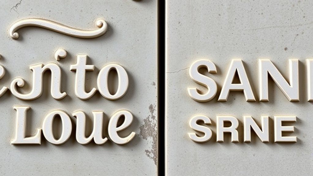
Have you ever wondered how skilled artisans transform raw materials into stunning carved lettering? It’s a fascinating process that combines artistry, precision, and a deep understanding of lettering techniques. When carving lettering, artisans choose styles that communicate different moods and eras, often influenced by historical styles and cultural contexts. Serif and sans-serif styles represent two fundamental directions in this craft, each with distinct characteristics shaped by their historical influences. Understanding these differences helps you appreciate the purpose behind each style and the techniques used to bring them to life.
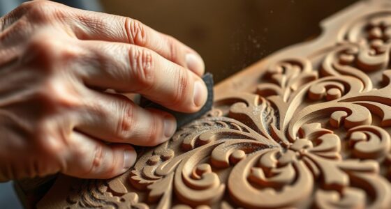
Serif lettering, with its small projecting strokes at the ends of characters, has a rich historical background. It traces back to ancient inscriptions carved into stone and metal, where serifs served both aesthetic and practical functions. These strokes helped guide chisel movements, making the carved letters more legible and stable over time. Over centuries, serif styles evolved through classical Roman inscriptions, medieval manuscripts, and Renaissance printing, each era adding its unique flair. When applying lettering techniques for serif carving, artisans pay close attention to the flow of lines and the subtle details of serifs, ensuring they reflect the style’s historical roots. The carving process often involves careful chipping and scraping to create the delicate, precise serifs that give serif fonts their traditional, formal appearance.
Serif carving reflects a rich history of guiding lines and elegant details rooted in ancient inscriptions.
In contrast, sans-serif styles strip away these ornamental strokes, resulting in cleaner, more modern lines. Historically, sans-serif fonts gained popularity during the modernist movement of the 20th century, emphasizing simplicity and minimalism. Their origins can be traced back to early 19th-century typefaces, but they truly became prominent with the rise of contemporary design. When carving sans-serif lettering, artisans focus on bold, straightforward lines that emphasize clarity and impact. The techniques involve precise chisel work to achieve uniformity and smoothness, often with less emphasis on decorative flourishes. Sans-serif styles are favored for signage and branding because they convey a sense of modernity and efficiency, making the carving process more about precision and consistency than ornate detail.
Ultimately, choosing between serif and sans-serif styles depends on the message you want to communicate and the context of your project. Both styles have deep historical influences that continue to shape modern carving techniques. By understanding these influences and mastering the appropriate lettering techniques, you can create carved lettering that resonates with tradition or embraces contemporary simplicity. Whether you’re carving timeless serif fonts or sleek sans-serif designs, each style offers a unique way to express your artistic vision and connect with viewers through carefully crafted, meaningful lettering.

Afantti Wood Burning Pen Leather Pyrography Burner Tool Kit | 26 Letters | Temperature Adjustable | for Woodburning Crafts
【Adjustable Temperature Level】There are two power options: 30W and 15W. 30W for wood burning; 15W for leather burning;…
As an affiliate, we earn on qualifying purchases.
As an affiliate, we earn on qualifying purchases.
Frequently Asked Questions
Which Style Is More Durable for Outdoor Plaques?
You’ll find sans-serif styles more durable for outdoor plaques because they generally have better weather resistance and require less maintenance. Their clean, simple lines withstand the elements better, reducing chipping or fading over time. Serif styles, with their intricate details, tend to trap dirt and are more susceptible to weather damage. For longevity and easier upkeep, opt for sans-serif carving styles suited for outdoor conditions.
Can Serif and Sans-Serif Styles Be Combined in One Project?
You can definitely blend serif and sans-serif styles in one project through mixed style integration, which adds visual interest. Using font blending techniques, you highlight the unique qualities of each style, creating a cohesive and dynamic design. Carefully pairing these styles guarantees harmony without clutter, making your project stand out. Embrace this approach for a balanced, professional look that leverages the strengths of both serif and sans-serif fonts seamlessly.
What Tools Are Best for Carving Serif Lettering?
For carving serif lettering, you should use precision tools suited for detailed work. Hand engraving tools like fine chisels and gravers allow you to carve intricate serif details with control. Power carving tools, such as rotary tools with small bits, also work well for faster, consistent results. Combining both methods helps achieve crisp, professional serif lettering, giving you flexibility and precision in your carving projects.
How Do You Choose the Right Style for Historical Reproductions?
You should choose the style that best reflects the historical period you’re reproducing. Serif styles often convey a sense of tradition and authenticity, making them ideal for historical accuracy. Sans-serif fonts lend a modern, clean look, suitable for contemporary artistic styles. Consider the era’s typical lettering, the context of the piece, and the overall aesthetic you want to achieve to guarantee your carving aligns with both historical accuracy and artistic intent.
Are There Specific Fonts That Translate Better Into Carved Lettering?
This question hits harder than a hammer to stone! When choosing fonts for carved lettering, stick to simple, bold styles like serif fonts with clear, distinct lines. These fonts enhance readability and highlight carving detail, making your work stand out. Avoid overly intricate fonts that get lost in the carving process. Opt for classics like Times New Roman or Garamond—timeless choices that translate beautifully into carved art, ensuring your message stays sharp and clear.

OriGlam 10pcs Professional Wood Carving Chisel Set – Carbon Steel Woodworking Tools, Power Grip Chisels Great for Carving and Woodworking
√ Heat Treated – Made from heat-treated, chrome vanadium steel alloy with a ground finish and narrow side…
As an affiliate, we earn on qualifying purchases.
As an affiliate, we earn on qualifying purchases.
Conclusion
So, whether you prefer the timeless charm of serif or the sleek modern vibe of sans-serif, remember: carving your lettering is all about making a statement—literally. Don’t overthink it; after all, who needs elegance when you can have bold, blocky letters that scream *”Look at me!”* Just pick your style, carve away, and hope your craftsmanship doesn’t resemble a toddler’s doodle. Happy carving, and may your letters never fade… or at least, not too soon.
Mikisyo Power Grip Carving Tools, 7 Piece Set (Japan Import)
Power Grip Carving Tools. Easy-to-hold and non-slip grip. A product of Mikisyo, a Japanese manufacturer. Easy to maintain,…
As an affiliate, we earn on qualifying purchases.
As an affiliate, we earn on qualifying purchases.

Wood Burning Kit, 163 Pcs Wood Burner Tool Kit with letters and numbers, Pyrography Pen with Adjustable Temperature Control Various Tips Stencils, Woodworking Leather Embossing Carving Soldering
【Multifunctional Wood Burning Tool】:This wood burning kits includes 1* Wood Burner Pen, 28* Wood Burning Tips, 26*letters,10*numbers, 5*…
As an affiliate, we earn on qualifying purchases.
As an affiliate, we earn on qualifying purchases.