
To master color theory for wood accents, you need to understand undertones—warm reds or cool blues hidden beneath the surface. Recognizing these helps you choose colors that either complement or contrast effectively. Finishes can enhance or mute undertones, shaping the mood of your space. Balancing or contrasting woods and hues creates harmony or visual interest. Keep exploring how subtle color interactions and finishes can elevate your design by applying these principles.
Key Takeaways
- Recognize warm, cool, and neutral undertones in wood to inform harmonious or contrasting color pairings.
- Use finishes to enhance or mute undertones, influencing overall mood and visual depth.
- Match or contrast undertones across furniture, walls, and accessories for cohesive or dynamic spaces.
- Incorporate contrast by pairing cool-toned woods with warm hues or vice versa for visual interest.
- Balance undertone interactions through color choices and finishes to create intentional, harmonious interiors.
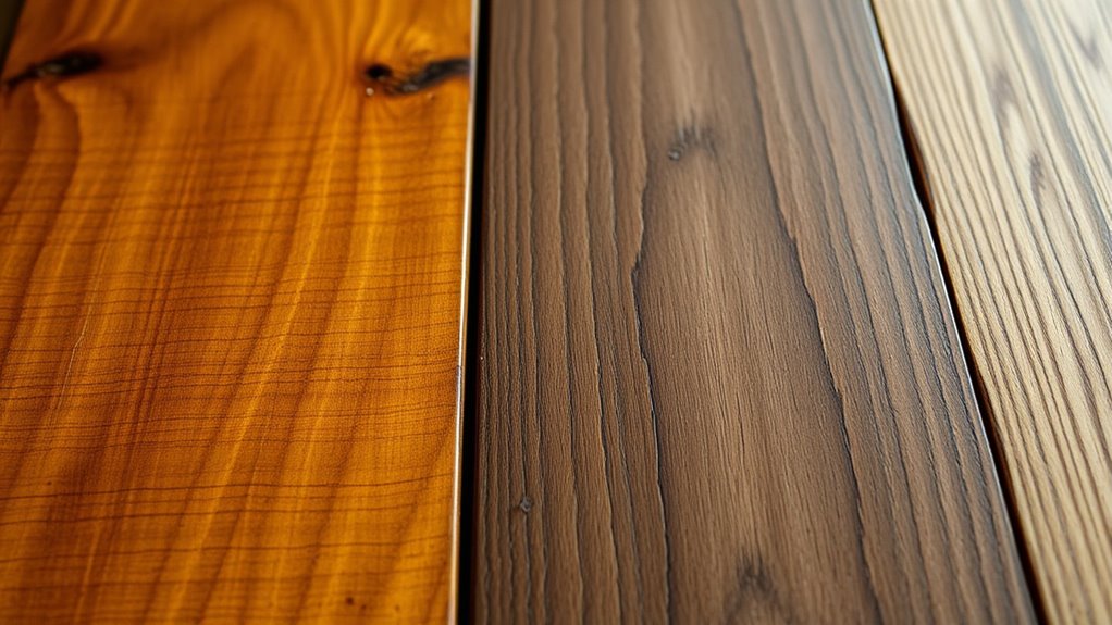
When choosing wood accents for your space, understanding color theory can make all the difference in creating a harmonious and visually appealing environment. One key aspect to consider is how the undertones of different woods interact with your overall color palette. Undertones are subtle hues beneath the surface color, such as warm reds, cool blues, or neutral beiges. Recognizing these undertones helps you select woods that either complement or contrast with other elements in your room, leading to a balanced aesthetic. For example, if your walls have warm undertones, opting for woods with similar warm undertones will create a cohesive look, while contrasting cool-toned woods can introduce visual interest.
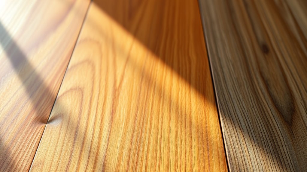
To achieve the desired effect, you should consider finishing techniques that enhance or modify these undertones. Different finishes, like stains or sealants, can subtly shift the perceived color of a wood accent. A light, transparent finish preserves the natural undertones, maintaining a subtle harmony with your existing decor. Conversely, darker stains can deepen warm undertones or mute cooler ones, giving you more control over the mood of the space. When using finishing techniques, keep in mind that they also influence how light interacts with the wood, affecting its overall appearance and how it pairs with other colors. Additionally, understanding how undertones influence color matching**** can help you create more cohesive and balanced designs.
Color matching is another essential element when working with wood accents. It involves selecting complementary or contrasting hues to create a cohesive or dynamic environment. For instance, if your furniture and walls are primarily neutral, choosing a wood accent with a warm undertone can introduce warmth and richness. Alternatively, selecting a wood with cool undertones can add a touch of sophistication and freshness. To make effective color matches, pay attention to the undertones of not just the wood but also other elements in the room, such as textiles, artwork, or accessories. This ensures everything works together seamlessly, avoiding jarring contrasts or clashing hues. When you understand the undertones and how to manipulate them through finishing techniques, you gain greater control over your design. This knowledge allows you to create depth and harmony, whether you aim for a calm, unified space or a vibrant, contrasting one. Remember, the key is to observe how different woods react to various finishes and consider how their undertones align with your overall color scheme. By doing so, you’ll craft a space that feels intentional, balanced, and visually captivating, all thanks to a solid grasp of color matching and finishing techniques.
Frequently Asked Questions
How Do Natural Lighting Conditions Affect Wood Undertones?
Natural light substantially impacts how wood undertones appear, causing a noticeable color shift throughout the day. In bright natural light, warm undertones like honey or red may seem more vibrant, while cooler undertones can become subdued. Overcast or shaded conditions tend to soften these hues, making the undertones less distinct. You should observe your wood samples in different lighting to understand how natural light influences their true color and undertones.
Can Paint Colors Influence the Perception of Wood Contrast?
Did you know that 85% of interior designers say paint colors markedly affect how wood contrast appears? Yes, your chosen paint can enhance or diminish your wood grain textures. Matte finishes tend to soften contrast, while high-sheen paints amplify it. By carefully selecting paint colors and sheen options, you can control the perception of wood tones, creating harmony or striking contrast that complements your space perfectly.
Are There Specific Finishes That Highlight Undertones Better?
Yes, certain finishes and gloss levels highlight undertones better. Satin or matte finishes tend to subtly emphasize undertones, while high-gloss finishes reflect light and can intensify contrast. Finishing techniques like staining or sealing with tinted products enhance warm or cool undertones. By choosing the right gloss level and applying finishing techniques carefully, you can make wood undertones stand out beautifully, creating a more dynamic and appealing look.
How to Choose Complementary Colors for Accent Walls?
You should choose complementary colors for accent walls by considering color mixing and color psychology. Opt for hues opposite on the color wheel to create striking contrast, which adds visual interest. Think about the mood you want—calm, energetic, or cozy—and pick colors that evoke those feelings. Trust your instincts and test small patches to see how different shades interact with your wood accents, ensuring harmony and balance in your space.
What Tools Help Identify Subtle Undertones in Wood?
Identifying subtle undertones in wood is like peeling back layers of a story. You can use a color-matching tool or digital color meter to analyze the grain patterns and stain options accurately. A portable spectrophotometer is especially helpful for pinpointing exact shades, revealing warm or cool undertones. These tools help you make informed decisions, ensuring your wood accents harmonize beautifully with your overall color scheme.
Conclusion
Understanding color undertones and contrast is like mastering a secret code for your space. When you choose wood accents thoughtfully, they become the soul of your room, harmonizing or creating striking focal points. Think of it as painting a masterpiece—you’re adding the perfect brushstrokes to bring everything to life. With this knowledge, you can confidently select wood pieces that complement your decor, making your home feel as warm and inviting as a cozy fireside chat.