Design principles like proportion, balance, and symmetry are key to creating visually appealing and effective designs. You guarantee elements relate in size and placement, guiding the viewer’s eye naturally. Proper balance distributes visual weight evenly, while symmetry provides stability and harmony. When combined, these principles help communicate your message clearly and make your visuals feel organized. Exploring these concepts further will equip you with the tools to craft cohesive, impactful designs.
Key Takeaways
- Proportion ensures elements are sized relative to each other to establish visual hierarchy and clarity.
- Balance distributes visual weight evenly, creating harmony and preventing layouts from feeling chaotic.
- Symmetry creates stability through mirrored arrangements, reinforcing structure and predictability.
- Proper use of these principles guides viewer focus, enhances message clarity, and fosters overall harmony.
- Integrating proportion, balance, and symmetry results in cohesive, visually appealing, and effective designs.

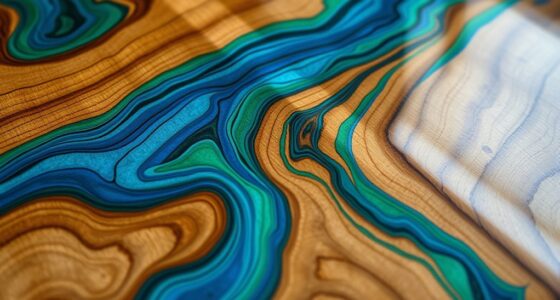
Have you ever wondered what makes a design truly effective? It all comes down to understanding and applying core principles like proportion, balance, and symmetry. These elements work together to create visuals that are not only pleasing to the eye but also communicate your message clearly. When you focus on proportion, you’re guaranteeing that each element in your design is sized in relation to others, helping to establish visual hierarchy. Proper proportion guides the viewer’s eye naturally across the composition, emphasizing what’s most important without overwhelming or confusing. Balance is about distributing visual weight evenly across your design, whether through symmetrical arrangements or asymmetrical but carefully weighted placements. This prevents your layout from feeling lopsided or chaotic, fostering harmony that feels intuitive to viewers. Symmetry, in particular, creates a mirror-like effect that can evoke feelings of stability and order. When used thoughtfully, it provides a sense of structure and predictability that reassures the viewer. Additionally, understanding visual hierarchy helps to prioritize elements effectively and guide the viewer’s attention seamlessly through the design.
Color harmony plays a significant role in reinforcing these principles. When your colors are chosen with harmony in mind, they complement each other and strengthen your overall design. Consistent color schemes can evoke specific emotions and set the tone, making your message more impactful. For example, a monochromatic palette can create a sleek, cohesive look, while complementary colors can add vibrancy and energy. It’s vital to consider how colors interact and influence the viewer’s perception of balance and proportion. Just as important are your typography choices, which act as visual anchors within your design. Clear, well-selected fonts enhance readability and reinforce the message’s tone. Good typography choices ensure that your text complements the overall harmony, proportion, and balance of your layout. Avoid cluttered or inconsistent font styles, and instead opt for typefaces that align with the mood and purpose of your design. When combined with thoughtful color harmony, your typography choices can elevate the entire composition, making it more engaging and easier to navigate.
Frequently Asked Questions
How Do Cultural Differences Influence Perceived Proportions?
Your cultural aesthetics and perceptual norms shape how you perceive proportions. In some cultures, exaggerated features might be valued, while others prefer harmony and subtlety. These differences influence your judgment of what looks balanced or proportionate. By understanding these cultural variations, you can create designs that resonate with diverse audiences, ensuring your work aligns with their perceptual norms and aesthetic preferences.
Can Balance Be Achieved Without Symmetry?
You can definitely achieve balance without symmetry; it’s not a case of “all or nothing.” Visual harmony and aesthetic stability come from different elements working together, even if they’re asymmetrical. This approach creates interest and movement in your design. By carefully balancing weight, color, and form, you can craft a dynamic composition that feels stable and pleasing, proving that balance isn’t solely about perfect mirroring.
What Role Does Color Play in Proportion and Balance?
Color plays a vital role in achieving proportion and balance by creating color harmony, which guides the viewer’s eye and fosters visual unity. You can use contrasting or complementary colors to emphasize specific areas or create emotional impact, helping to balance elements within your design. When you thoughtfully select colors, you enhance the overall harmony and emotional resonance, ensuring your composition feels well-proportioned and balanced without relying solely on symmetry.
How Do Digital Designs Utilize These Principles Differently?
Digital designs utilize these principles differently by leveraging tools that enhance visual harmony and aesthetic scaling. You can easily adjust proportions and balance through grids, guides, and responsive layouts, ensuring elements align perfectly across devices. Interactive features and animations further emphasize symmetry and balance, creating a seamless user experience. This flexibility allows you to dynamically maintain proportion and visual harmony, making your designs more engaging and visually appealing in a digital environment.
Are There Exceptions Where Asymmetry Enhances Design?
You’ll find that embracing dynamic asymmetry and organic proportions can beautifully elevate a design, adding a sense of movement and authenticity. Sometimes, breaking away from strict symmetry creates visual interest and guides the viewer’s eye naturally. When executed thoughtfully, asymmetry can evoke emotion and personality, making your design feel fresh and engaging. So, yes—there are plenty of instances where asymmetry isn’t just acceptable but truly enhances the overall impact.
Conclusion
Think of your design as a well-orchestrated symphony, where proportion, balance, and symmetry are the instruments working in harmony. When you master these principles, your creations become a visual melody that captivates and guides the viewer’s eye effortlessly. Remember, just like a skilled conductor, you control the rhythm and flow. Keep practicing, and your designs will resonate with beauty and harmony, transforming simple elements into a masterpiece that speaks to everyone.