
To master stain matching using color theory, start by identifying the stain’s hue and intensity. Use a color wheel to find complementary colors that neutralize unwanted tones—like yellow with purple or red with green. Mix small amounts carefully and test on hidden areas first. Incorporate neutral tones such as gray or beige to fine-tune complex colors. With precise blends and an understanding of light conditions, you’ll improve your results—discover more techniques to refine your approach.
Key Takeaways
- Identify the stain’s hue and intensity to select the appropriate complementary color for neutralization.
- Use the color wheel to find opposite hues that can effectively cancel out unwanted stain tones.
- Start with small amounts of the complementary color and gradually blend to match the stain precisely.
- Test color blends on hidden fabric areas before full application to ensure accurate matching.
- Incorporate neutral tones like gray or beige to fine-tune complex color matches and improve overall concealment.
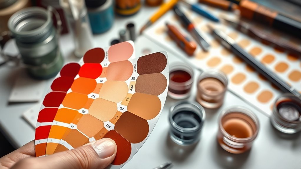
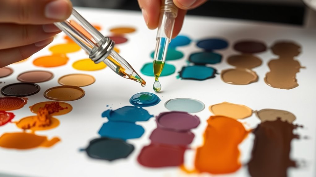
Stains happen unexpectedly, but matching them perfectly can be straightforward once you understand the basics. When you’re faced with a stain, the key is to identify its color and then determine how to blend or counteract it effectively. This is where understanding the color wheel and complementary colors becomes invaluable. The color wheel is a tool that shows how different hues relate to each other, making it easier to choose the right shade for a perfect match. Complementary colors sit opposite each other on the wheel, and mixing them can cancel out unwanted tones or create visually appealing blends. For example, if you see a yellowish stain, adding a small amount of purple can neutralize the discoloration because purple is complementary to yellow.
When matching a stain, start by observing its hue and intensity. Once you’ve identified the color, consult the color wheel to find its complementary color. Using complementary colors helps you develop a custom blend that neutralizes or enhances the original stain. For instance, a red stain can be toned down with a touch of green, since green is opposite red on the wheel. By understanding this relationship, you can create a balanced mixture that either conceals the stain or integrates seamlessly into the fabric or surface. This approach is especially useful when working with fabric dyes, paints, or stain removers, where precise color matching is *essential*. Recognizing the importance of automation in business can help streamline the process of achieving consistent color matches across multiple projects.
Remember that when combining colors, less is often more. Start with small amounts of the complementary hue and gradually adjust until you reach the desired tone. It’s a good idea to test your blend on a hidden area first, to see how it interacts with the original color. Keep in mind that lighting conditions can affect how a color appears, so check your work in different lighting before proceeding. If you’re matching a stain on a fabric or surface with complex coloration, consider mixing in neutral tones like gray or beige to fine-tune the match without overpowering the original tone.

Tulip One-Step Tie Dye Kit, Large Group Activity, Gift, 14 Vibrant Colors, Permanent Fabric Dye, Easy Clean-up, 18 Prefilled Full-Size Bottles and Tools
- Dyes up to 36 projects: Suitable for 6 people
- Easy activation: Add water to bottles
- No presoak needed: Skip soda ash pre-treatment
As an affiliate, we earn on qualifying purchases.
As an affiliate, we earn on qualifying purchases.
Frequently Asked Questions
How Do Lighting Conditions Affect Stain Color Perception?
Lighting impact plays a vital role in how you perceive stain colors, often revealing perception nuances that vary with conditions. Under warm lighting, stains may appear richer or more vibrant, while cool lighting can make them seem duller or muted. You should check stains in different lighting environments to guarantee color accuracy, as inconsistent lighting can lead to mismatched or flawed results. Always consider lighting impact for precise stain matching.
Can Color Theory Help With Multi-Tone Stain Blends?
Ironically, thinking color theory can’t help with multi-tone stain blends is common—yet it’s exactly what you need. It guides you in achieving color harmony and shade consistency across different tones, preventing a jarring look. By understanding how colors interact, you can create seamless blends that look intentional, not mismatched. So, yes, color theory is your secret weapon to master multi-tone stains and elevate your craftsmanship.
What Tools Are Best for Accurate Stain Color Matching?
To get accurate stain color matching, you should use digital color tools like a handheld spectrometer. This device measures the precise color of your stain or wood surface, ensuring consistency. By relying on digital color readings, you minimize guesswork and improve match accuracy. Combining this with your eye for detail helps you create perfect custom blends, especially when working with multi-tone stains, making your projects look professional and polished.
How to Correct Mismatched Stain Colors After Application?
If you notice mismatched stain colors after application, don’t panic. Use a color wheel to identify complementary hues that can help you correct the mismatch. Lightly blend a small amount of the complementary color into the existing stain, working gradually to achieve a seamless match. Test on a hidden area first, and keep adjusting until the color blends naturally, ensuring a professional finish.
Does Material Type Influence Stain Color Blending Techniques?
Ah, the age-old question—does material type influence stain color blending? Absolutely. You need to take into account fabric texture and stain absorption because they dictate how the stain interacts with the surface. Different materials absorb dyes differently, affecting blending techniques. For example, a smooth silk may require a delicate approach, while a coarse linen demands a more robust method. Understanding these nuances ensures your color match is seamless and professional.
Conclusion
So, after all this fuss about color theory, you’d think matching stains is a breeze, right? Turns out, it’s just as tricky as picking the right paint shade—only with more patience and less room for error. But hey, if you finally nail that perfect custom blend, you’ll feel like a true artist. Irony? It’s all about embracing the chaos, because sometimes, the best matches come from a happy accident—or a little color theory magic.